The Five Best And Five Worst Olympic Stadiums, An Unofficial Ranking
In one possible Olympics origin story, a desperate King Iphitos of Elis sought the famed Oracle of Delphi’s advice amidst tremendous unrest and civil war in the eighth century BC. The oracle sagely suggested that he hold a great athletic competition while declaring a truce among the cantankerous city-states for their duration. And so, for a few centuries, athletes from around the Hellenistic world would peacefully gather to slather themselves in olive oil, wrestle and race, and presumably drop proto-John Starks “first and foremost all praise due to Zeus, no question no question!” post-match interviews. Eventually, the sad-eyed Theodosius I, the last ruler of a united Roman Empire, outlawed the fun and games in 394 AD.
It’s safe to say that the International Olympic Committee, founded in 1894 by Pierre de Coubertin—a man so down for the cause that his heart is buried in Olympia, Greece—won’t last nearly as long. Many potential hosts are wising up to the fact that the games present more burdens than benefits. Former Supreme Court Chief Justice Earl Warren (possibly) once said, “I always turn to the sports section first. The sports page records people’s accomplishments, the front page has nothing but man’s failures.” Going by Justice Warren’s sensible opinion, the Olympics fail as escapist entertainment because it’s impossible to enjoy them without thinking of the massive exploitation, corruption, and hypocrisy that fuel the movement.
Olympic architecture is perhaps the least sinful aspect of the IOC’s legacy, despite a heinous history of clogging deeply indebted hosts’ meager coffers with, to put it politely, whimsically useless fluff like Athens’ softball stadium. But cities and nations have long used ostentatiously monumental stadia to puff out their chests and showcase their technological prowess. For example, the Panathenaic Stadium, which hosted the Olympics-esque Panathenian Games, was first built in the 4th century BC of Poros limestone and then rebuilt almost entirely of opulent Pentelic marble a few hundred years later. Unobtrusively built into an Athenian valley near the Acropolis, it was eons ahead of its time, and exemplifies Frank Lloyd Wright's philosophy that buildings should cradle their environments. It is of the hill yet not on the hill.
The Olympics leave behind mountains of debt, negligible effects on sports participation, negative effects on tourism, and debatable effects on international peace as; nary a peep was heard at Salt Lake City 2002 after George W. Bush launched the unironically-named Operation Enduring Freedom in Afghanistan only 21 years after a mass boycott of the 1980 Moscow games over a similarly disastrous invasion. Putting politics aside, all the money that hosts waste on the Olympics used to at least produce beautiful stadiums. But lately even that has gone by the wayside as austerity, which has yet to hit Olympic bribery, influenced London’s insipid stadium—which somehow still cost a senses-shattering £700 million pounds—Rio’s tepid recycling of its already-existing Maracanã and João Havelange stadiums, and Tokyo’s cowardly cancellation of Zaha Hadid’s breathtaking 2020 design.
What we’re left with is the worst of both worlds as astronomical sums are being spent on aesthetically abject architecture. To better understand where Olympic architecture is going let’s take a look back at the best and worst Olympic stadia.
The Five Best
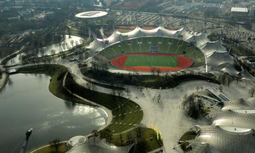
1. Olympiastadion, Munich (1972)
In the Panathenaic’s spirit, Munich’s stadium looks effortlessly nestled into its surrounding landscape. It symbolizes post-war Germany’s rise from the ashes as the stadium bowl is literally built into a hollow created by WWII bombings. Its translucent roof, built using a meticulous process that involves layering acrylic glass over guy cables stayed by steel masts, remains unsurpassed as a stadium-engineering marvel. Dominique Gauzin-Müller, a French architect and critic, admiringly said, “[t]here is a unique dialogue, a harmony, between the sports fields and the park, hardly to be found anywhere else…Despite the size of the buildings, all huge and suffocating monumentality was avoided.” The idea of a roof that protects fans from the elements, while still letting the sunshine in, is still a foreign concept in the United States; look to the depressingly opaque new roof at the US Open’s Arthur Ashe Stadium or the grass-threatening new canopy over Dolphins (née Joe Robbie, Pro Player, Dolphin (singular), Land Shark, and Sun Life) Stadium for proof. The bright new Minnesota Vikings Stadium is an exception, but most American stadiums try their best to block out the outside world through massive TV screens and scoreboards. The Olympiastadion stands apart. It lets you daydream while comfortably letting your gaze wander skyward.

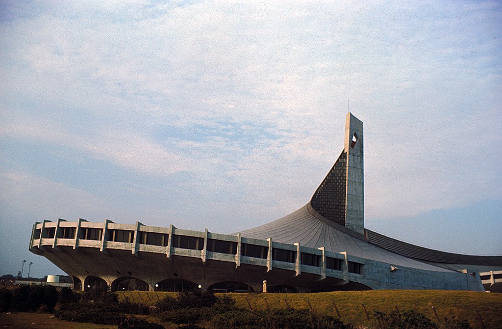
2. Yoyogi National Gymnasium, Tokyo (1964)
When Kenzō Tange won architecture’s prestigious Pritzker Prize in 1987, Fumhiko Maki, the designer of 4 World Trade Center and a Pritzker-winner himself, glowingly wrote, “[t]he National Gymnasium for the Tokyo Olympics of 1964 was a magnificent product of twentieth century structural technology, as well as a bold and original conception of space. It is one of the landmarks of modern architectural history and assured the highest international reputation for Tange.” Tange’s design, highlighted by a roof that flows out in gentle concrete waves from two central steel cables, surpassed the mid-century architectural and engineering norms to become a singular structure that endures to this day.

3. Spyros Louis Olympic Stadium, Athens (2004)
Santiago Calatrava’s modern twin-arched jewel is the spiritual inheritor to Munich. His curved roofing elevated a generic concrete bowl from anonymity to the envy of the world. Sir Norman Foster tried something similar with his exposed steel arch for the new Wembley Stadium, but it’s all height with no grace. Calatrava may be best known for bloated budgets, like his elegantly wasted $4 billion WTC PATH Hub, but if you’re going to go bankrupt you may as well go bankrupt in style.

4. The Bird’s Nest, Beijing (2008)
The former New York Times architecture critic Nicolai Ouroussoff said, in describing the retrograde and debauched duds that are Yankee Stadium III and Citi Field, “most serious architects today strive to create buildings that reflect the values of their own era, not a nostalgic vision of the past, no matter how open they may be toward their surroundings.” Few stadiums reflect this.
And, to be fair, it would be difficult for them to do so. It’s fundamentally hard to make a massive building look both appealing and approachable. In this country, stadium design is hampered, like Scott Baio’s finest work, by a warped deference for the 1950s. European architects have a little more freedom, as perhaps best evidenced by Jacques Herzog and Pierre de Meuron’s work. Their Allianz Arena, home to both Bayern Munich and 1860 Munich, is the global standard for shared stadiums and glows in stark contrast to the basic-even-for-SimCity MetLife Stadium. Their masterpiece is the Bird’s Nest, and a lot of the credit for its existence goes to the Chinese government for giving them the latitude to create something so strange. Peter Richmond, theorizing for Grantland, said “[m]y guess is that the Beijing Olympics organizers didn’t sit down on Day 1 and say, ‘First off, which fast-food franchise should we put at the top of all the mezzanine escalators: Snake Shack or a Canton Cat Taco? What’s going to work, maximum-bucks-wise? And should we go with a Michael Jordan Steakhouse or Hard Time Café in the end zone?’” It shows.
Herzog and de Meuron best described the Bird’s Nest themselves, saying “What is seen from afar as a geometrically clear-cut and rational overall configuration of lines, evaporates the closer one comes, finally separating into huge separate components. The components look like a chaotic thicket of supports, beams and stairs, almost like an artificial forest.”

5. Palazzetto dello Sport, Rome (1960)
Like Madison Square Garden and its concave ceiling, the Palazzetto is justifiably more famous for its interior than exterior. Pier Luigi “The Great Italian God of Concrete” Nervi engineered its hypnotic ceiling using ferrocemento slabs. Its construction involved an ingenious system he perfected himself that involves casting cement mortar over steel mesh patterns. Evocative of the Pantheon’s oculus, the Palazzetto’s swirling diamond-patterned dome has towered over such basketball names as Dino “I Dunked on Chris Mullin at the ’92 Olympics” Radja, Brandon “I’ll be the Knicks Starting Point Guard After Derrick Rose Blows Out his Knee by Thanksgiving” Jennings, Allan “Shuttlesworth Jesus” Ray, Tyus “Miracle Against Missouri” Edney, Rick “Beef Brother #1” Mahorn, Michael Cooper, and George “The One Thing I Could Do was Finger Roll” Gervin. They also had an Olympics there, but let’s keep things in perspective.
The Five Worst

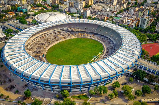
1. Maracanã Stadium & The João Havelange Olympic Stadium, Rio de Janeiro (2016)
Sócrates Brasileiro Sampaio de Souza Vieira de Oliveira, MD, known simply as Sócrates, was an iconic player in Brazilian soccer history. Aside from his brilliant play and his abiding commitment to social justice, he was a fascinating looking man. Tall and lanky, he would wear white headbands with slogans like “Amor, No Terror” that held back cascading waves of jet black hair, framing a face with deep set eyes and severe Abraham Lincoln-ian cheekbones.
If his look were a stadium, that stadium would be São Paolo’s beguiling Arena Corinthians, the new home of the club for whom Sócrates starred for six years. Ronaldo Luís Nazário de Lima, known simply as Ronaldo, is another iconic Brazilian player. But looks-wise, with his sugarloaf-ian physique, prominent chompers, and vacant gaze, there’s no comparison to Sócrates. His only memorable look was when he appeared at the 2002 World Cup sporting a monkish tonsure atop his shaved head. In that sense, Ronaldo’s stadium spirit animal is his hometown Maracanã, a formerly plain-looking concrete donut whose pre-World Cup/pre-Olympics makeover consisted mainly of adding a domineering roof made of John Gotti-worthy Teflon. It’s surprising that Brazilian soccer supporters hadn’t already torn down the Maracanã in anger, as this is the same house of horrors that hosted Uruguay’s infamous 1950 World Cup win in the game that made Brazil cry and Germany’s 7-1 defenestration of the seleção in the 2014 semifinal.
The Estádio Olímpico João Havelange, named for the Fred Thompson-looking, finely-jowled, fantastically-corrupt former FIFA head, split “official Olympic Stadium” status with the Maracanã, the first time two stadiums have shared that status since Paris 1900. The Havelange’s suspended roof is the only feature that differentiates this bald concrete bowl from the Macy’s on Queens Boulevard. Carlos Porto and Gilson Santos, the Havelange’s architects, took their slavish imitation of Calatrava too far, as serious structural problems with the roof forced the stadium’s closure in 2013 for two years. When you get the delays and cost overruns right and nothing else, you haven’t gotten it right at all.

2. Grand Arena of the Central Lenin Stadium / Luzhniki Stadium, Moscow (1980)
When the Boris Yeltsin-led Russian Federation emerged from the Soviet Union’s collapse it swapped one of the world’s most instantly recognizable flags for one of its most anonymous. Another Russian symbol, its national stadium, is just as forgettable. The Luzhniki is emblematic of one of two types of Muscovite architecture. On the one hand there are incomparable works like the transcendent Monument to the Conquerors of Space, the monumental Moscow State University Main Building, and the otherworldly St. Basil’s Cathedral. On the other hand there are bores and eyesores like Moscow’s ubiquitous and unyielding tower blocks, the drab slab Russian White House, Le Corbusier’s brown sludge Tsentrosoyuz building—which, and this is not a compliment, is most reminiscent of Lower Manhattan’s Murry Bergtraum High School—and the seemingly Gore Verbinski-inspired Peter the Great statue.
The Luzhniki falls squarely in the latter category, and itself provides sufficient justification for Jimmy Carter pulling the U.S. out of the 1980 games. Massive renovations are underway ahead of the 2018 World Cup with an emphasis on preserving the crumbling exterior façade. But what is there to save? The exterior is a dowdy derivative of Berlin’s Olympiastadion. Up Moscow’s Third Ring Road, Dynamo Stadium, the Luzhniki’s other doppelgänger, was knocked down to make way for an otherworldly Fabergé-skinned orb from the 22nd Century. Meanwhile, all the Luzhniki is getting is a new roof that will be able to display giant ads to the outside world. So basically a very expensive digital version of Citi Field’s sad Goya beans billboard that faces the Whitestone Expressway. What a country!

3. Stade Olympique, Montreal (1976)
In the 1970s the Quebecois dropped bombs all over Canada in their separatist quest. None were bigger than the brutal Stade Olympique. Architect Roger Taillibert, who is also guilty of designing Paris’ parking structure-esque Parc des Princes, delivered a building that looks more at home on the Moon than amongst the classically beautiful architecture of Île d’Montreal. His complicated design and construction delays meant that the adjoining tower and retractable dome, which never ended up working well anyway, weren’t finished until years after the 1976 Olympics. The CFL’s Alouettes and MLS’ Impact would rather brave the city’s frigid springs and autumns outside at McGill University and Saputo Stadium, respectively, rather than play in the Big Owe’s dankness. The Expos are long gone but, like a stale Costco croissant, Stade Olympique perseveres.

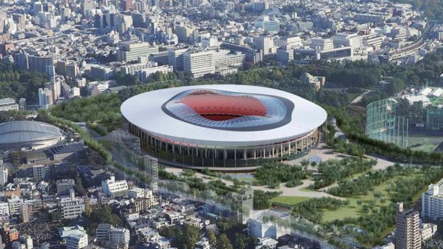
4. New Olympic Stadium, Tokyo (2020)
The late, great Dame Zaha Hadid set the standard for 21st century public architecture. Her greatest works were massive public gathering places that, freed from orthogonal oppression, gracefully invite us to pause, look around, and marvel at what is physically possible. Her soaring, dual-winged Aquatic Centre was London 2012’s architectural showstopper.
And her Tokyo 2020 Olympic Stadium would have been even more daring and triumphant. It would have let natural light pour through its roof like Munich’s Olympiastadion and been as bewitching as Beijing’s Bird’s Nest while surpassing both. But Japan’s insular, male-dominated architectural elite reacted to Hadid’s selection with fear and loathing. Finally, last year, Japanese Prime Minister Shinzō Abe hid behind austerity in announcing that Kengo Kuma would replace Hadid on the project.
It’s not just that the savings aren’t worth it. They also aren’t really much in the way of savings: Kuma’s tired stadium will still cost more than $1.25 billion to build. Kuma’s design seems inspired by Dolly Parton’s quote that, “it takes a lot of money to look this cheap.” Kuma’s stadium is a late 20th century retread to the max—donut shape, exposed decking, exposed columns, and so on. In lacking a façade and exposing its structure, Kuma shows that he has nothing to say. While its roof will feature pleasant wooden trusses, it will block natural light more than Mr. Burns’ sun-shield. And Kuma somehow forgot to include space for the Olympic Cauldron, an IOC requirement. On top of all that, Hadid’s firm is pursuing litigation over claims that Kuma’s copied his interior designs from Hadid.

5. Turner Field, Atlanta (1996)
The grandest American civic architecture, like Manhattan’s Municipal Building, Grand Central Terminal, the New York Main Public Library, San Francisco’s City Hall, the Golden Gate Bridge, DC’s Union Station, Chicago’s Union Station, the Chicago Museum of Science, Grant Park, Cleveland’s Terminal Tower, and Detroit’s Fox Theater represent civic pride at its most beautiful. They project strength, security, and a sense that what we do and build here will endure. Our stadiums were once like that too, but the new breed represents our increasingly disposable culture where, from our gated golf community McMansions, to our car-chassis SUVs, to our 2-year cycle phones, nothing is meant to last.
Some 23 of the 30 Major League ballparks opened after 1990. The Minnesota Timberwolves’ Target Center debuted only a few days before Ricky Rubio was born in 1990 and yet it is the fifth-oldest NBA arena. The Target Center will soon seem as ancient as the Roman Colosseum as teams start to emulate the Atlanta Braves, who are fleeing Turner Field after only 20 years.
Atlanta’s 1996 Olympic Stadium was never anything special, to be honest. Its generic brick exterior made it look like just a bigger REI store and as aesthetically unchallenging as layering a Patagonia fleece vest over a checkered oxford. Like quickly scarfing down Chipotle in Hartsfield Airport between connections, all Atlanta got in Turner Field was an utterly unmemorable experience en route from one place to another, with the notable exception that this is an unmemorable experience that cost hundreds of millions of dollars. Turner Field is emblematic of the vapid consumerist temples that post-war cities like Atlanta, Charlotte, Phoenix, and Las Vegas have contributed to American architecture. Future explorers will find nothing like the Panathenaic amongst our ruins, although they will probably be impressed by how many parking spaces we made.
Garo Gumusyan, AIA and his son, Aram Gumusyan have been glumly going to the "The World's Most Famous Arena" since Hubie Brown was coaching the Knicks.
